Archangel Capital
Identity and web
2020
____________________
Erich Beyer is a real estate investor with passion for his town of Phoenixville, Pennsylvania. As he was navigating conversations with investors and stakeholders, he recognized a need for a more unified brand that communicated trustworthiness and uncompromising standards, which is why he sought out a Blitz with Sherwood Fellows. While he got that brand and website, he also got something he didn’t expect: a deeper understanding of the heart behind his work.

The Starting Point
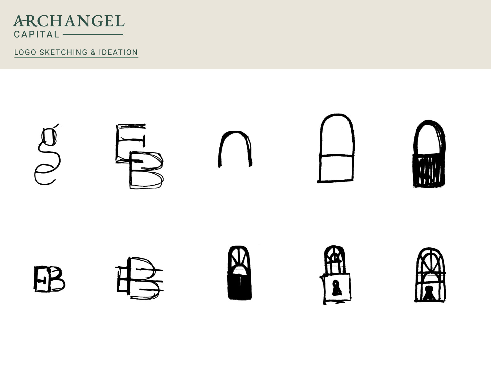
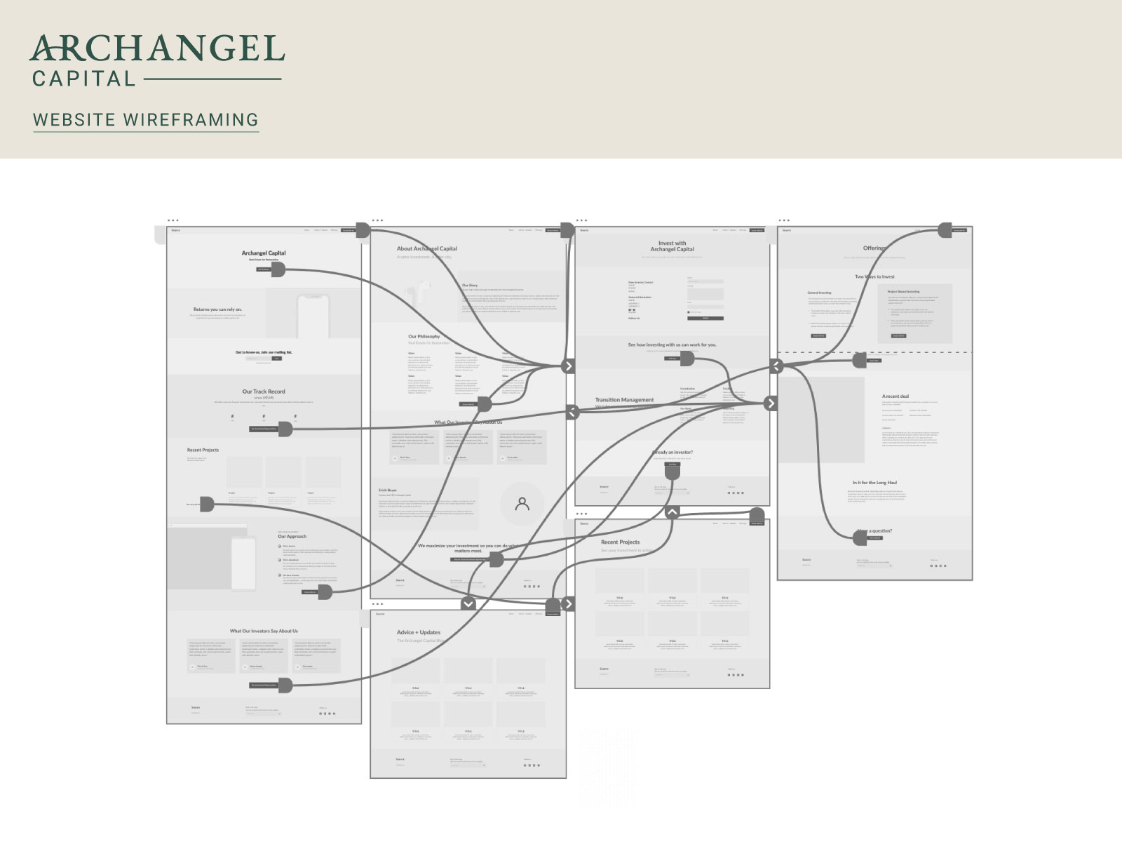
Logo symbol ideation and website wireframing
Discovering and communicating values.
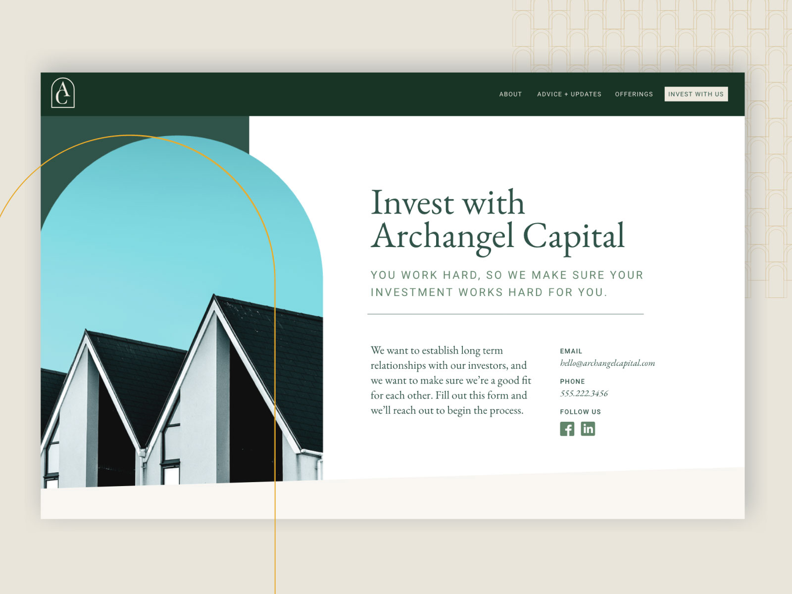
Our discovery process unearthed values that Erich had never fully articulated before. He knew that his business was meaningful, but before our Blitz he didn’t quite know the depth that existed in it. Our custom manifesto renewed his passion for his work, so we intentionally incorporated taglines and body copy throughout his website that alluded to his values. This served a twofold purpose: it built a foundation of trust for the right investors while weeding out those who wouldn’t align with his ideals.

Surprising serendipities.
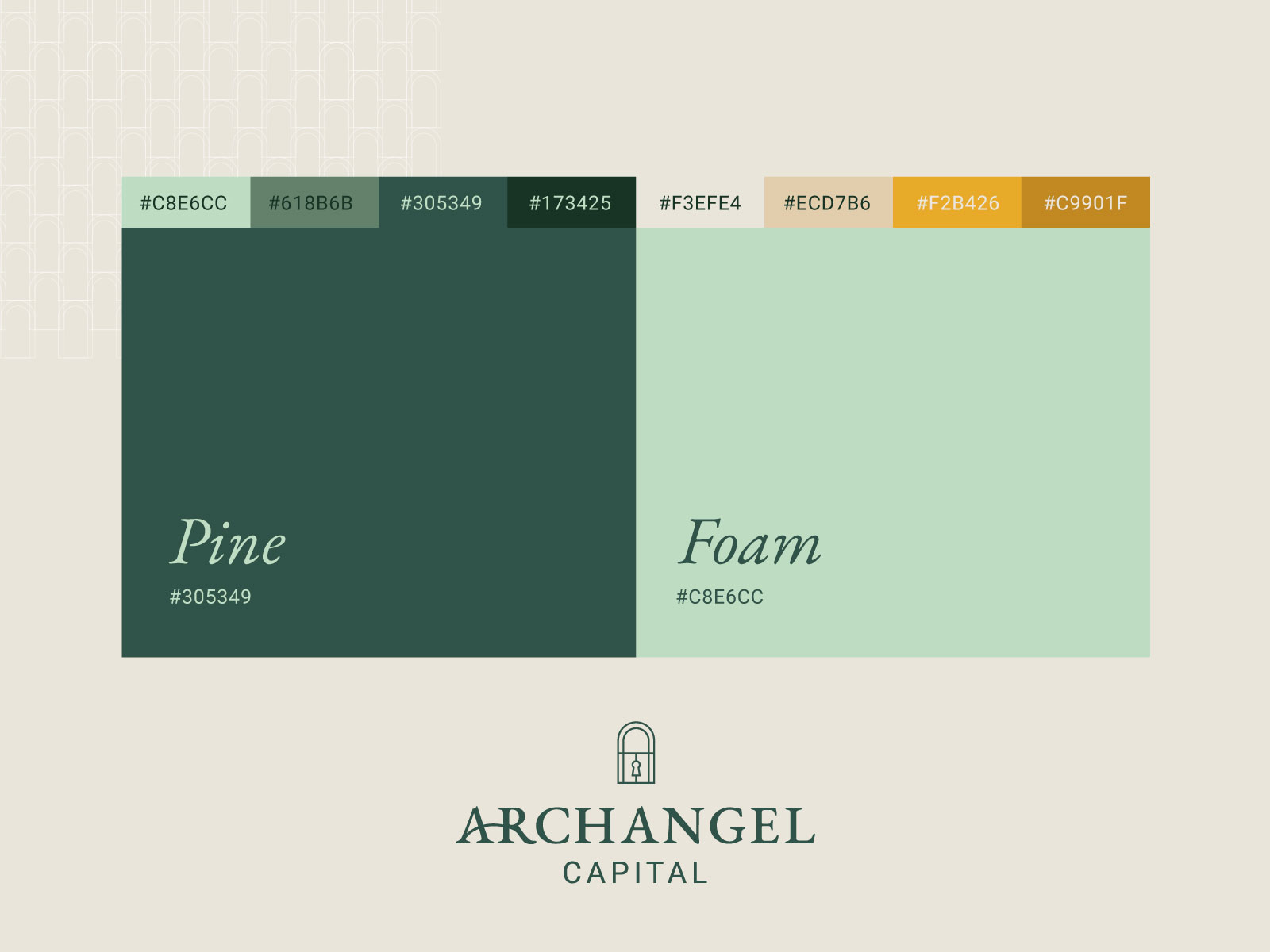
Archangel Capital’s brand communicated Erich’s commitment to the utmost quality. Its sleek, regal design incorporates muted colors, with a repeated motif of an arch, which symbolizes new opportunities and open doors. This archway motif also found serendipitous alignment when our design team experimented with a lock symbol, which subtly incorporated Erich’s love of collecting unique locks — which he hadn’t told us about before he saw the symbol!
As Erich has utilized his new brand identity through meetings, he’s had successful payoff. He stands out in a crowded field for his professionality and meaningful ideals.

Copyright © 2023 Longwood Studios
“Muad'Dib knew that every experience carries its lesson.”
– Frank Herbert, Dune
– Frank Herbert, Dune